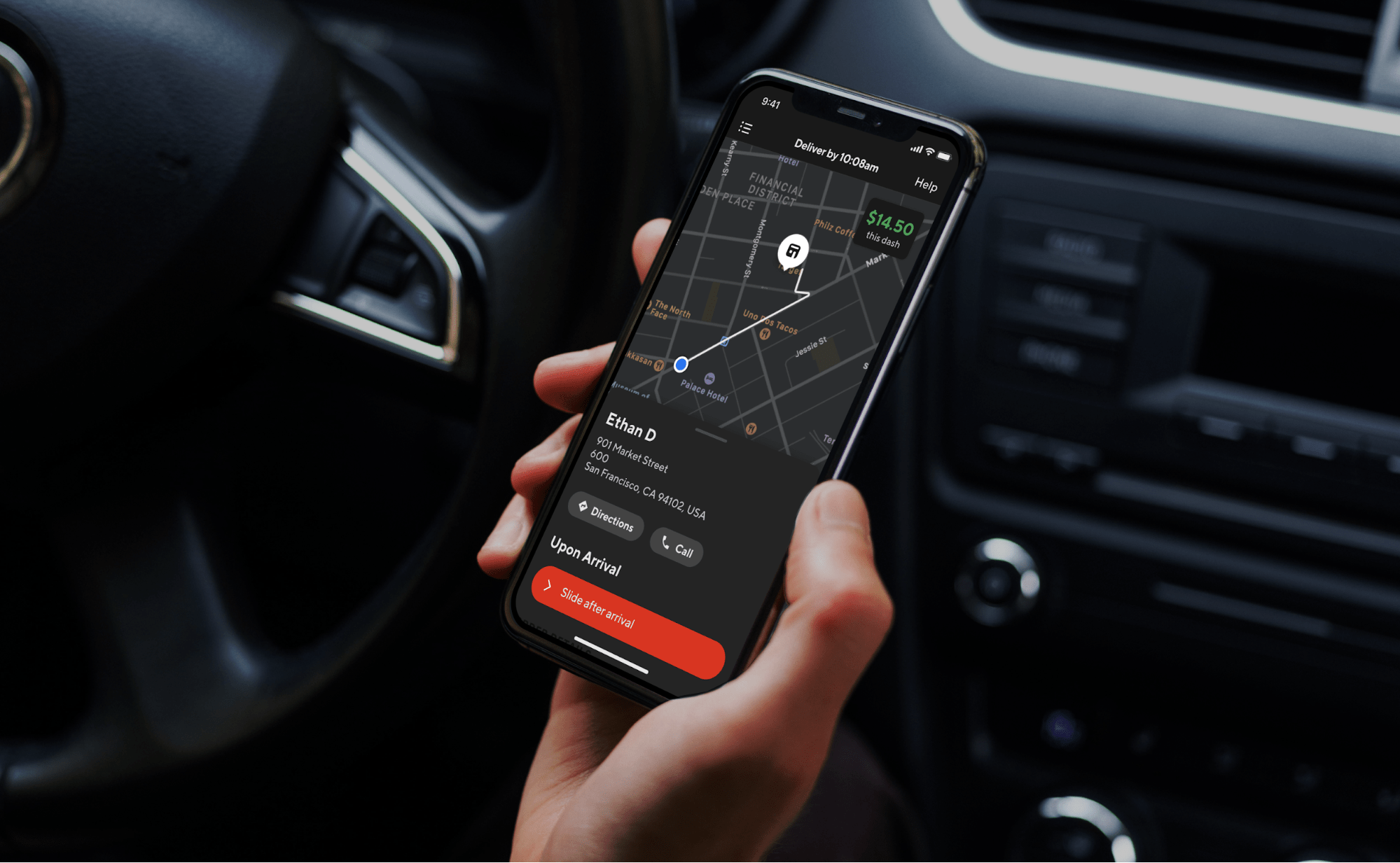
A large number of our DoorDash deliveries happen during the evening and in late night hours. Dashers, our delivery partners, were finding it really hard to use the Dasher app because the app’s bright screens did not adapt to the lower lighting conditions. The abundance of white in the design meant that critical information, such as pickup or dropoff instructions, order items, and even just directions to the next destination, were hard to read in the dark.

In addition to this readability problem, extended exposure to bright screens at night can result in dry and itchy eyes, blurred vision, and headaches. Last, but not least, increased screen brightness in low-light environments can reduce battery life at a critical time when Dashers are on the road. In short, these issues resulted in an overall subpar experience with the platform and decreased Dasher satisfaction.
Striving for a solution, a few engineers formed a team during a hackathon week to create Dark Mode, a common feature on many mobile apps that changes the color scheme to darker colors so it's easier to read and less hard on users' eyes in darker environments, for our Dasher apps. While we focused on the most critical delivery screens, we realized that the experience would be incomplete without supporting Dark Mode throughout the whole Dasher app. Implementing Dark Mode required overcoming several design and engineering challenges.
On the design front, the main challenge was to define and create a design theme that could move programmatically from the default Light Mode to Dark Mode. Additionally, the team had to come up with new design elements because the existing ones would not translate over upon switching to Dark Mode. Effectively, this meant re-architecting our design system to abstract UI components and colors into higher-order semantics that can in turn translate to multiple colors based on context and environment.
On the engineering front, all of our colors used in the app screens were hard-coded RGB, causing inconsistencies even within our own branding. Developers were manually setting the same red color in various screens, resulting in added development time and unintentional copy errors. In addition, these hard-coded colors meant that we could not adjust the UI programmatically based on appearance or light conditions.
Overall, we needed to work on a scalable solution to not only have a custom Dark Mode in the app, but also a way to define our UI to seamlessly adapt to the best Dasher experience for the current environment and conditions.
Building Dark Mode with a programmatic design theme
To solve the UX problem and the issues our frontend teams were having with a unified design, we built a programmatic template and installed Dark Mode. Our team built Dark Mode first by creating a design system that could represent the DoorDash and Caviar brands in darker colors, and then implementing the design system as well as the Dark Mode swap into our Android and iOS apps.
Building a robust color semantic architecture in our design language system
Supporting Dark Mode is not as easy as flipping a switch, or simply inverting the colors black for white, and vice versa. It required a coordinated team effort to design a dark version of the app, and then enable users to seamlessly toggle between the dark and light versions.
The first thing we did to design Dark Mode was to audit the current On-a-Dash user flow in the Dasher app. We soon noticed that supporting Dark Mode only for the On-a-Dash flow was the same amount of work as supporting the entire app, so our audit and implementation expanded to all other screens in the Dasher app. Approximately, we used 50-plus screenshots of the most representative screens to provide color specifications on all text, icons, borders, and backgrounds.
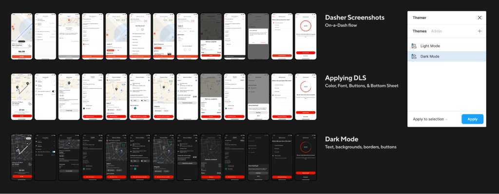
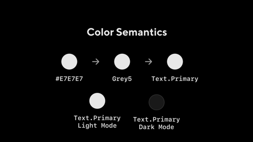
The second step was to analyze our current color semantic architecture, the color names that tell us how, when, or where a color should be used. At the time, we had 121 color semantics in our design language system (DLS). We created a naming structure (i.e. Location + Property + State) that would allow us to scale in the future. As an example, ‘Button.Background.Pressed’ indicates type, location, and state.
We also expanded our semantics to cover some missing ones and added support for all of our components. At the end of this process we ended up with 223 color semantics. (Since we launched Dark Mode in February, 2020, we have added 214 more!). Each of these color semantics was mapped to a color token (e.g. Red60) not only for Light Mode and Dark Mode, but also for Caviar and our merchant app, giving us complete theming capabilities.
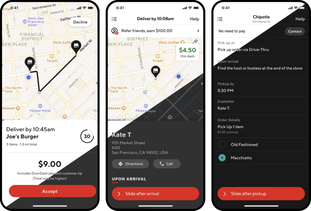
One critical step in this process involved testing our new colors for Dark Mode in a dark room. This testing revealed that all colors, whites, and dark greys look completely different in a dark setting. For example, we don’t use full white or black in Dark Mode because white bleeds too much into nearby pixels and makes it harder to read.

Finally, once we had a complete set of screens from the audit, and the color architecture needed, we began specifying the screens in Figma by annotating the correct color for all text labels, icons, buttons, borders, and backgrounds.
Open communication was critical at every stage of the process between the Design and Engineering teams. Our close communication allowed us to quickly test and fix all the problems we saw in the app.
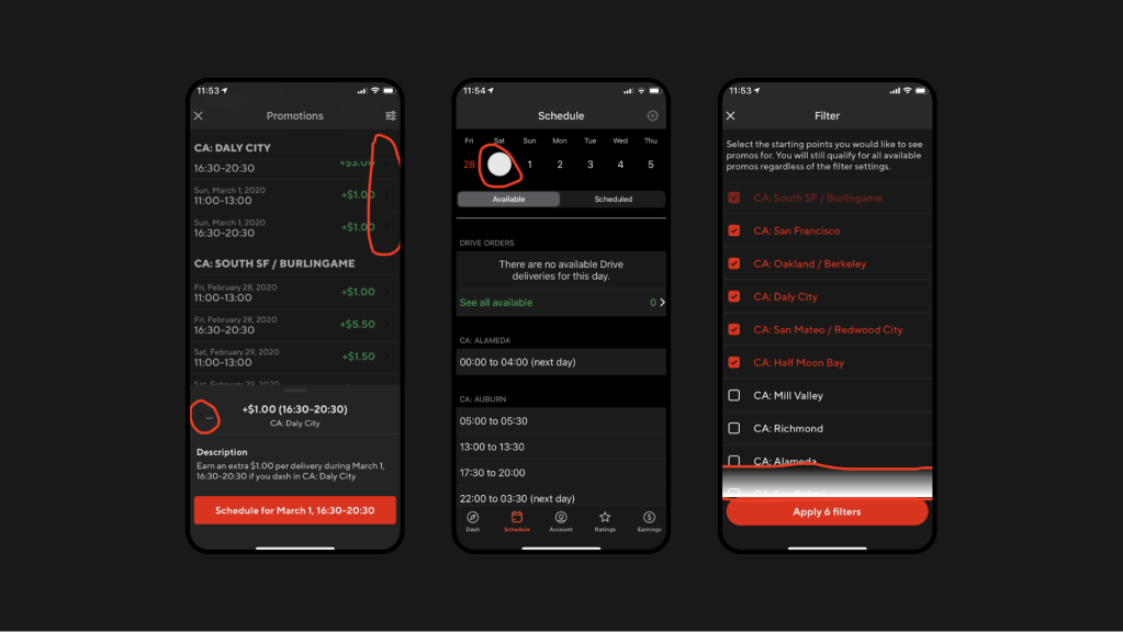
Last, but not least, we used this opportunity to not only update all our colors in the app, but also some components, such as buttons, Bottom Sheets, and icons.
Building a system design theme: iOS detailed implementation
Beginning with iOS 13, Apple introduced semantically defined system colors for UI elements that adapt to both Light and Dark Modes. The vast majority of our Dashers who use iOS devices were already using the newest iOS version, so we decided to leverage this new functionality and build on top of our existing semantic color architecture in our DLS.
Here are the steps we took to implement Dark Mode:
Ensure the app is not hard-coded for Light Mode
In the app’s Info.plist, make sure UIUserInterfaceStyle either is not present, or it’s set to Automatic. This will allow the UI to automatically adapt based on the system’s appearance settings.
Convert the existing colors to DLS semantics
Leverage the DLS to translate our hard-coded RGB colors into semantic colors that describe the element rather than a specific color, For example, instead of using #FFFFFF for black text, use .text(.primary) to denote that the color used is for text that has a primary purpose on the screen, such as titles. To do this, follow these steps:
- List all the RGB colors being used in the app.
- Come up with a conversion chart for each color depending on its context. For example, (#000000 - white) maps to:
- .
primary(.background) for a page background. - .
button(.primary(.foreground)) for button text. - .
modal(.background) for a modal popup.
- .
- Go over all the Swift files in the project and change them from RGB to their corresponding color semantic using the conversion chart from above.
- The .
xibfiles are harder to convert because XCode does not show search results from .xib files. For this, use Visual Studio Code or another IDE that is able to search .xib files in XML format, and replace the colors there as well. - Make sure to remove any
UIColorextensions or helper libraries in the code base that return hard-coded colors, so the rest of the developers in the team know not to use them as they continue to develop other features.
Verify all the DLS semantic colors have defined `any` and `dark` appearance
Make sure all of the tokens for the semantic colors in the list from the previous step have both light and dark appearances defined. iOS 13 made this easier by allowing multiple tokens to be associated with one semantic, as shown in Figure 7, below:

Ensure every color for every UI element is set
After tackling all of the existing colors in the previous steps, move on to tackling all the elements that might not have a specific color set. These elements would be leveraging default system colors instead of the DLS theme that should be applied. Take a second pass at all the views (programmatic and .xibs) to make sure every element has a semantic color properly defined, including for foreground and background. Make sure nothing is pointing at a default or system value.

While defining every color for every UI element can seem like a daunting task, one helpful way to do this is to temporarily and locally override the DLS theme to return a very bright color, such as purple, every time a DLS semantic color is correctly used. This will visually separate the colors that are correctly using the DLS theme from the ones that are not.
struct CustomTheme: ThemeProvider {
    func color(for token: ColorAssets) -> Color {
        .systemPurple
    }
}

Then run the app, and focus on fixing anything that is not purple!

Images should use multiple tokens or be defined as templates
When tackling images, the complexity of the asset should determine the approach to use. For simple images that have a single color trace, define the image set to render as template image by default, and set the tint color to a semantic color that will change based on light or dark appearance, as shown in Figure 11, below:


More complex images with several traces, especially ones that should not change based on appearance, are better handled with an additional set of assets to handle dark mode, as shown in Figure 12, below:

Transitions between Light and Dark Mode should be seamless
Once every UI element has been updated to using a semantic DLS color value, it’s necessary to make sure the transition between light and dark appearances is smooth, especially when the app is open. We can rely on the framework to automatically transition most of our colors, but the concept of Light and Dark Mode is implemented in UIKit, not in CoreAnimation. This means that the CoreAnimation layer does not know how to respond to an appearance change, so the color needs to be explicitly updated. For this, we can use UIKit’s traitCollectionDidChange, which is a callback function for when the appearance changes.
    override func traitCollectionDidChange(_ previousTraitCollection: UITraitCollection?) {
        super.traitCollectionDidChange(previousTraitCollection)
        if previousTraitCollection?.userInterfaceStyle != traitCollection.userInterfaceStyle {
            updateColors() // update the colors if the appearance changed.
        }
    }
Multiple iterations and testing are crucial
This entire process is a huge overhaul of all of the UI elements, components, and screens. Iterate on testing and bug fixing by going through all of the app flows, making sure to verify for both light and dark appearances, as well as transitions between them.
Developing an Android Dark Mode theme
When implementing Dark Mode for Android devices, there were two options:
- “Easy Dark Mode” with the Force Dark option - Android 10 and above devices
While support for Dark Mode was not new on Android, the Android 10 update introduced a system-level toggle to switch between dark and light themes. Because users now have this option, they expect most apps to also support Dark Mode.
Hence the Android framework offered the Force Dark option, a quick solution to support Dark Mode. The side effect of this shortcut is that there is minimal control over how the app looks, and the feature is only supported on devices running Android 10. This wasn’t the best option for us because we needed the same look and feel across multiple devices, not just Android 10, and we also were looking for better customizability on how we design our app in Light and Dark Modes.
- Dark Mode with a custom implementation - works for all Android-supported versions
Building a custom implementation is an ideal approach, as it enables a custom dark theme offering complete control over how to define the look and feel of the app. This technique is a bit time-consuming and requires more developer-hours than the former approach, but it works on all devices, not just Android 10.
Another advantage to this second approach is extensibility; this architecture inherently supports multi-theme and requires very minimal changes in the future.
Updating the parent theme from light to night mode
Our app currently uses Android’s AppCompat theme, and even though it’s usually recommended to switch to MaterialComponents themes, we decided not to. We made this choice because components may break or change the look and behavior of the app, requiring extensive end-to-end testing before making any big changes.
In our case, we decided to update the AppCompat theme:
- From
“Theme.AppCompat.Light.NoActionBar”to "Theme.AppCompat.DayNight.NoActionBar" - The DayNight theme here enables the “values-night” resource qualifier.
As explained above, if it's not possible to do a complete transition to the MaterialComponents theme due to time constraints and other challenges, then inherit from the Material Components Bridge theme instead. Bridge themes basically inherit from the AppCompat themes, but also define the new Material Components theme attributes. When using a Bridge theme, start using the Material Design components without changing the app theme.
Update to “Theme.MaterialComponents.DayNight.NoActionBar.Bridge”
Add a new “values-night” and “drawable-night” resource directory to hold resources for Dark Mode
- Add a new
`colors.xml`resource file inside`values-night`directory that holds all the colors necessary for Dark Mode. The app uses the resources from here when the app is in Dark Mode. - Leverage our DLS to translate all hard-coded RGB colors into semantic colors that describe the element rather than a specific color. Then, for each element, define corresponding color tokens in Dark Mode.
- For example:
- Before
 <color name="text_black">#191919</color>
 <color name="color_white">#fffff</color>
<color name="bg_whisper">#E7E7E7</color> - After - Light Mode
 <color name="text_primary">#191919</color>
 <color name="background_primary">#fffff</color>
<color name="border_primary">#e7e7e7</color> - After - Dark Mode
 <color name="text_primary">#E7E7E7</color>
 <color name="background_primary">#191919</color>
 <color name="border_primary">#313131</color>
Add a switch to toggle between Light and Dark Mode
For Android 10, there is a system-level switch to toggle between Light and Dark Modes. To support older Android versions, we added a toggle option within our app Settings page which can be used to switch between Light and Dark Modes.

Implementation to switch between Light and Dark Modes:
fun changeAppTheme(themeType: ThemeType) {
   when (themeType) {
       ThemeType.LIGHT_MODE -> {
           AppCompatDelegate.setDefaultNightMode(AppCompatDelegate.MODE_NIGHT_NO)
       }
       ThemeType.DARK_MODE -> {
           AppCompatDelegate.setDefaultNightMode(AppCompatDelegate.MODE_NIGHT_YES)
       }
       else -> {
           if (Build.VERSION.SDK_INT >= Build.VERSION_CODES.Q) {
               AppCompatDelegate.setDefaultNightMode(AppCompatDelegate.MODE_NIGHT_FOLLOW_SYSTEM)
           } else {
               AppCompatDelegate.setDefaultNightMode(AppCompatDelegate.MODE_NIGHT_AUTO_BATTERY)
           }
       }
   }
}

Create a new resource file named `themes.xml` i.e res/values/themes.xml
Theming is basically the ability to systematically design a product to better reflect its brand. Themes and styles are different. A theme is a collection of attributes that refer to app resources and get applied to the whole app or view hierarchy, whereas styles get applied only to a specific view.
Before we defined the system level and new theme attributes, we moved all the theme-related implementation to its own file called `themes.xml`. This helps organize our code better by increasing readability and maintainability, while also setting a clear separation between styles and themes.
Set up theme attributes for an app theme
As mentioned in our official documentation, `A theme is a collection of named resources called theme attributes that's applied to an entire app, activity, or view hierarchy`. Hence, every view we use in our layout is interested in some of these attributes.
Let’s look at how our app theme attributes are defined with appropriate semantic values as per our design specifications and then later referenced in our layouts and views.
Previously, our theme was incomplete, with many system-level attributes still set to default, while others were hard-coded and not referring to our design specifications.
<style name="AppTheme" parent="Theme.AppCompat.Light.NoActionBar">
   <item name="colorPrimary">@color/red</item>
   <item name="colorPrimaryDark">@color/@darker_red</item>
   <item name="colorAccent">@color/red</item>
   <item name="android:windowBackground">@color/background_gray</item>
   <item name="android:textColorPrimary">@color/dark_grey</item>
   <item name="android:textColorPrimaryInverse">@android:color/white</item>
   <item name="android:textColorSecondary">@color/heading_grey</item>
   <item name="android:textColorTertiary">@color/light_grey</item>
   <item name="android:textColor">@android:color/black</item>
   <item name="colorControlActivated">@color/red</item>
   <item name="colorControlNormal">@android:color/darker_gray</item>
</style>

As shown below, we then updated all system-level theme attributes with appropriate semantic colors and values with corresponding color tokens defined for both Light and Dark Modes in our DLS.
<!-- Color palette  -->
<item name="colorPrimary">@color/primary</item>
<item name="colorAccentedPrimary">@color/text_accented_primary</item>
<item name="colorAccentedSecondary">@color/text_accented_secondary</item>
<item name="colorAccent">@color/on_accent</item>
<item name="colorOnSecondary">@color/text_primary</item>
<item name="colorOnError">@color/text_error</item>
<item name="colorOnPrimary">@color/text_primary</item>
<item name="colorPrimaryDark">@color/primary_dark</item>
<item name="colorOnBackground">@color/text_primary</item>
<item name="colorControlActivated">@color/red</item>
<item name="colorControlNormal">@android:color/darker_gray</item>
<item name="android:windowBackground">@color/background_primary</item>
<item name="android:textColor">@color/text_primary</item>
<item name="android:editTextColor">@color/text_primary</item>
<item name="android:colorAccent">@color/on_accent</item>
<item name="android:textColorPrimary">@color/text_primary</item>
<item name="textColorDisabled">@color/text_disabled</item>
<item name="android:textColorSecondary">@color/text_secondary</item>

Apart from the system-level attributes, we have a large variant of typographies that we use in our app. We defined a number of custom theme attributes as per our semantic architecture, which then helped in promoting reusability of resources across the application.
Typography
<item name="android:textAppearance">@style/TextAppearance.Regular.TextFieldText.Medium</item>
<item name="android:textAppearanceSmall">@style/TextAppearance.TextFieldText.Small</item>
<item name="android:textAppearanceMedium">@style/TextAppearance.TextFieldText.Medium</item>
<item name="android:textAppearanceLarge">@style/TextAppearance.TextFieldText.Large</item>
<item name="textAppearanceTextFieldText">@style/TextAppearance.TextFieldText.Medium</item>
<item name="textAppearanceTextFieldTextPrimary">@style/TextAppearance.TextFieldText.Medium.Primary</item>
<item name="textAppearanceRegularTextFieldTextSmall">@style/TextAppearance.Regular.TextFieldText.Small</item>
<item name="textAppearanceRegularTextFieldText">@style/TextAppearance.Regular.TextFieldText.Medium</item>
<item name="textAppearanceRegularTextFieldTextPrimary">@style/TextAppearance.Regular.TextFieldText.Medium.Primary</item>
<item name="textAppearanceRegularTextFieldTextLarge">@style/TextAppearance.Regular.TextFieldText.Large</item>
<item name="textAppearanceSmallLabel">@style/TextAppearance.SmallLabel</item>
<item name="textAppearanceTextFieldLabel">@style/TextAppearance.TextFieldLabel</item>
<item name="textAppearanceMajorPageTitle">@style/TextAppearance.MajorPageTitle</item>
<item name="textAppearancePageTitle">@style/TextAppearance.PageTitle</item>
<item name="textAppearancePageDescriptionBody">@style/TextAppearance.PageDescriptionBody</item>
<item name="textAppearancePageSubtext">@style/TextAppearance.PageSubtext</item>
<item name="textAppearanceSectionTitleLarge">@style/TextAppearance.SectionTitleLarge</item>
<item name="textAppearanceSectionTitle">@style/TextAppearance.SectionTitle</item>
<item name="textAppearanceSectionSubtext">@style/TextAppearance.SectionSubtext</item>
<item name="textAppearanceContentBody">@style/TextAppearance.ContentBody</item>
<item name="textAppearanceLabel">@style/TextAppearance.Label</item>
<item name="textAppearanceCalloutLabel">@style/TextAppearance.CalloutLabel</item>
<item name="textAppearanceNavBarTitle">@style/TextAppearance.NavBarTitle</item>
<item name="textAppearanceButtonSmall">@style/TextAppearance.ButtonSmall</item>
<item name="textAppearanceButtonMedium">@style/TextAppearance.ButtonMedium</item>
<item name="textAppearanceButtonLarge">@style/TextAppearance.ButtonLarge</item>
<item name="textAppearanceListRowTitleLarge">@style/TextAppearance.ListRowTitleLarge</item>
<item name="textAppearanceListRowSubtextLarge">@style/TextAppearance.ListRowSubtextLarge</item>
Define the Android system-level Window and Background colors:
Along with defining platform-level theme attributes, we also added new custom attributes as per our design language specifications. Similar to what we mentioned above, each of these attributes were then later assigned proper color tokens for Light and Dark Mode.
<!-- Window colors -->
<item name="android:windowDrawsSystemBarBackgrounds">true</item>
<item name="android:windowLightStatusBar" tools:targetApi="m">@bool/use_light_status</item>
<item name="colorBackgroundSecondary">@color/background_secondary</item>
<item name="colorBackgroundTertiary">@color/background_tertiary</item>
<item name="colorBackgroundElevated">@color/background_elevated</item>
<item name="colorBackgroundPrimaryInverted">@color/background_primary_inverted</item>
<item name="android:colorForeground">@color/on_accent</item>
<item name="android:colorBackground">@color/background_primary</item>
<item name="android:listDivider">@color/border_primary</item>
<item name="colorBorderPrimary">@color/border_primary</item>
<item name="colorBorderSecondary">@color/border_secondary</item>

<!-- Text colors -->
<item name="android:textColor">@color/text_primary</item>
<item name="android:editTextColor">@color/text_primary</item>
<item name="android:colorAccent">@color/on_accent</item>
<item name="android:textColorPrimary">@color/text_primary</item>
<item name="textColorDisabled">@color/text_disabled</item>
<item name="android:textColorSecondary">@color/text_secondary</item>
<item name="android:textColorPrimaryInverse">@android:color/white</item>
<item name="android:textColorTertiary">@color/text_tertiary</item>
<item name="textColorPositive">@color/text_positive</item>
<item name="textColorHighlight">@color/text_highlight</item>
<item name="textColorAction">@color/text_action</item>
Button foreground and background colors
<item name="colorButtonPrimaryForeground">@color/button_primary_foreground</item>
<item name="colorButtonPrimaryForegroundPressed">@color/button_primary_foreground_pressed</item>
<item name="colorButtonPrimaryForegroundHovered">@color/button_primary_foreground_hovered</item>
<item name="colorButtonPrimaryForegroundDisabled">@color/button_primary_foreground_disabled</item>
<item name="colorButtonPrimaryBackground">@color/button_primary_background</item>
<item name="colorButtonPrimaryBackgroundPressed">@color/button_primary_background_pressed</item>
<item name="colorButtonPrimaryBackgroundHovered">@color/button_primary_background_hovered</item>
<item name="colorButtonPrimaryBackgroundDisabled">@color/button_primary_background_disabled</item>
<item name="colorButtonSecondaryBackground">@color/button_tertiary_background</item>
<item name="colorButtonSecondaryToggleBackground">@color/button_secondary_toggle_background</item>
<item name="colorButtonSecondaryForeground">@color/button_tertiary_foreground</item>
<item name="colorButtonSecondaryForegroundPressed">@color/button_tertiary_foreground_pressed</item>
<item name="colorButtonSecondaryForegroundHovered">@color/button_tertiary_foreground_hovered</item>
<item name="colorButtonSecondaryForegroundDisabled">@color/button_tertiary_foreground_disabled</item>
<item name="colorButtonSecondaryBackgroundPressed">@color/button_tertiary_background_pressed</item>
<item name="colorButtonSecondaryBackgroundHovered">@color/button_tertiary_background_hovered</item>
<item name="colorButtonSecondaryBackgroundDisabled">@color/button_tertiary_background_disabled</item>

Updates to Dialog and Bottom Sheet themes. Following the same steps outlined above, we updated themes for the Dialog and Bottom Sheet components.
Updating layouts to refer to the theme attributes
After Step 5, we went over each one of the app layouts and updated the views to refer to the theme attributes from the hardcoded RGB values.
Example one
Below, we have screenshots of both Light and Dark Modes of our Promotions screen. Although they look almost identical, the Dark Mode should show a different color scheme. The reason they look the same is because the layouts were hard-coded to use white background RGB color values. 

Once we apply the fix, the screens adapt based on their state. 

Example two
Here, we have defined the style `AcceptDeclineInstructionsText` for a specific text view along with a hard-coded text color `@color/black`. And, due to the hard-coded values, the text became totally unreadable in Dark Mode.
<TextView
        android:id="@+id/details_footer_text"
        style="@style/AcceptDeclineInstructionsText"
        android:layout_width="0dp"
        android:layout_height="wrap_content"
        android:layout_marginTop="16dp"
        android:textColor="@color/black"
        android:visibility="gone"
        app:layout_constraintEnd_toEndOf="parent"
        app:layout_constraintStart_toStartOf="parent"
        app:layout_constraintTop_toBottomOf="@id/accept_modal_instructions"
        tools:text="If you decline this order, it won\'t affect your acceptance rate."
        tools:visibility="visible" />
To address text readability in Dark Mode, we updated the text view style to refer to a theme attribute called `textAppearanceSectionSubtext` that is defined in `themes.xml`. This theme attribute is just a style with all the properties defined, such as font typography, weight, and color semantic with necessary color tokens for Light and Dark Modes. With this in place, we moved from a static to a dynamic setting that can switch easily from Light to Dark Mode.
This attribute increases readability, reusability, and developer velocity, as developers don’t need to keep defining these one-off styles anymore. In addition, it gives more flexibility, as we can view component styles from one place and see it reflected throughout the app.
<TextView
        android:id="@+id/details_footer_text"
        style="?attr/textAppearanceSectionSubtext"
        android:layout_width="0dp"
        android:layout_height="wrap_content"
        android:layout_marginTop="16dp"
        android:visibility="gone"
        app:layout_constraintEnd_toEndOf="parent"
        app:layout_constraintStart_toStartOf="parent"
        app:layout_constraintTop_toBottomOf="@id/accept_modal_instructions"
        tools:text="If you decline this order, it won\'t affect your acceptance rate."
        tools:visibility="visible" />
Handling elevation (drop shadow) in Dark Mode
Elevated surfaces in Light Mode generally rely on a drop shadow, while keeping the primary and the surface background the same. In Dark Mode, however, we cannot purely rely on a drop shadow to elevate a surface because the background is already dark and it would render almost invisible. Inverting the drop shadow to a light color would result in a glowing effect around the surface which is not what we want.
Instead, we need to indicate elevation by using different background tones. The higher the elevation a surface is, the lighter the color of its background. In our case, we had to create a new shade of grey just for this purpose, as well as a new color semantic called Background.Elevated. Figure 24, below, shows an example of an elevated surface, a Bottom Sheet, and how it translates from Light to Dark Mode.

Supporting Dark Mode in Google Maps
Google Maps only supports Light Mode, and our app uses Google Maps for a number of use cases, including showing:
- Heatmaps and the nearby starting points in the home screen.
- Nearby hotspots when Dashers are waiting for orders.
- The pick-up and drop-off destination in the order acceptance screen and when a Dasher is driving to a merchant or to a consumer.
It's important for us to support the dark color scheme in Google Maps when in Dark Mode. Here is how to build Dark Mode into Google Maps:
This Styling documentation link explains how to apply map styles to Google Maps and it includes details on how to generate color schemes for both Light and Dark modes.
The configuration file used to apply map styles contains all the details required to customize elements such as the geometry, waypoints, polyline colors, background, and markers. In our case, we defined these using our DLS colors as the baseline.
Figure 25, below, shows our Dasher home page, which includes a map with all the nearby starting points and how busy they are.

Update all programmatic hard-coded references to use theme attributes
There might be some use cases where it's required to change colors programmatically, such as when a user completes a step in the ordering process and it changes color in the display. Because that change in the display is not statically defined in the layout we need to ensure it is treated as well. So, we identified such cases in the app and updated them to refer to theme attributes instead of RGB values.
One thing to note here is, when referring to theme attributes programmatically, it's important that we use view context in order to fetch the right resources. Application context is tied to the lifecycle of the application and it will always apply the default theme and resources that were selected during app launch and disregard any configuration changes done later.
Wins
Support for Dark Mode was a hit with Dashers, as it gave them an improved user experience, specifically enhanced readability in low light environments, decreased eye strain, and extended battery life, especially on OLED screens. After launching this experience, we heard extensive praise on our Dasher feedback channels and are happy to see an increasing number of Dashers leveraging Dark Mode while delivering at night.
On the design side, we expanded and improved how our DLS color semantics were structured. We created and documented all new color DLS theming libraries (Doordash, Caviar, and merchant) for both Light and Dark Mode. This provided us with a solid foundation for more robust theming abilities in DLS going forward. Additionally, this experience gave our Design team the expertise to create Dark Mode versions of any new or existing feature and product.
Building Dark Mode pushed us to build theming support that was consistent across multiple platforms. While this was a big lift it cleared the way to more easily build features that support Dark Mode across the company. In fact, this ensured that any new feature we developed from that point forward using DLS semantics would have support for Dark Mode out of the box. This also increased developer productivity and satisfaction and made it easier for the team to test both Light and Dark Mode for every feature we ship.
Conclusion
Supporting Dark Mode in mobile apps is a feature most users already expect and a requirement to provide beautiful and scalable UIs. DoorDash’s experience building Dark Mode is not unique. While it's quickly becoming a requirement, many companies utilize the same kind of statically built experience that does not support Dark Mode or adapt to appearance changes. This results in inconsistent and/or unreadable UI, and in the long run slows down development of new experiences. By building a semantic design structure and theming, companies can not only delight their customers with new features like Dark Mode but can also ensure better consistency and more easily apply changes in the future.

